professional visual style and a youthful color palette
Intuitive design for mobile
UX research
Competitor analysis
Current food ordering applications
Before designing the food ordering application, I conducted a competitive analysis focusing on two major market players: Wolt and Foodora. Both apps are widely used in Hungary and offer quick food delivery with modern interfaces.
I aimed to understand how they solve common user needs such as:
intuitive browsing of restaurants
seamless checkout experience
delivery tracking
My goal was to analyze how these services help users discover restaurants, place orders, and track deliveries – and more importantly, where the user experience could be further improved.
While both apps perform well in core functionality, I noticed some usability issues:
Limited clarity in navigating between different food categories
Overloaded restaurant listings, making it harder to decide quickly
Complex checkout flows with too many steps
This inspired me to design a more streamlined, visually clear, and user-centric experience. My app focuses on:
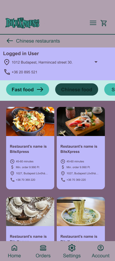
Easy filtering by restaurant type or cuisine
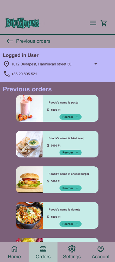
A quick overview of reordering favorites
An intuitive navigation with minimal steps to checkout
The analysis helped me identify best practices and also certain friction points that could be improved in a new solution.
Brainstorming
Ideas about development possibilities
Based on the pain points identified during the competitor analysis, I began brainstorming solutions to improve the overall user experience of the food ordering app.
I concentrated on three core areas:
Navigation simplicity – How can users quickly find their preferred restaurant or cuisine type?
Decision-making efficiency – How can we help users choose food faster, without overwhelm?
Seamless ordering flow – How can the cart and checkout process feel intuitive on mobile?
To explore these questions, I created quick paper sketches, grouped ideas by priority, and mapped out user expectations. This helped me identify the most critical touchpoints where clarity and speed were essential.
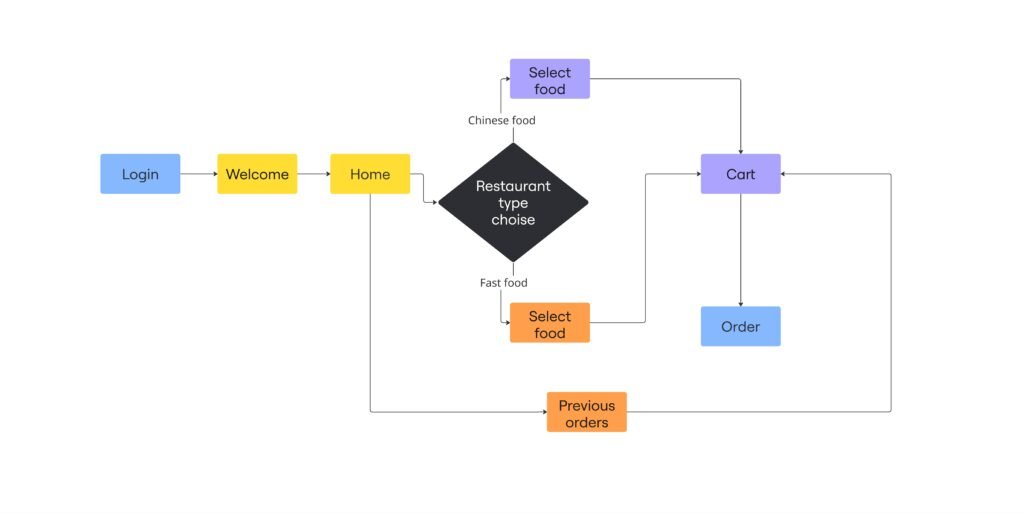
My goal was to craft a clean, frictionless experience — one where users feel in control and can get to their meal without delay or frustration. See the user flow chart below, which was made with the help of Miro. This phase focused on understanding user goals and mapping the most intuitive experience paths.
Prototype (low-fidelity wireframe)

At the early stage of the project, I used quick sketching and prototyping techniques to explore multiple directions. This allowed me to visualize ideas, identify user needs, and quickly test possible flows. These low-fidelity drafts helped shape the foundation of the product before moving into digital prototyping.
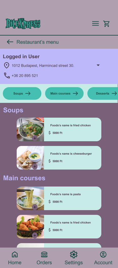
UI design (high-fidelity screens)
After defining the user flow and validating the structure with prototypes, I translated the concept into a clean, visually engaging user interface.
My focus was on clarity, consistency, and intuitive interaction. I selected a minimal yet vibrant color palette, modern typography, and layout choices that support the user’s journey from start to finish.
This stage was about shaping not just how the app looks — but how it feels to use.